
Long, flowing hair. Clearly beautiful. At the center of this poster’s story is an ambiguous relationship between a woman and a ball. Something about this reminds me of the association of women with “the land.” The beautiful game is beautiful, we are reassured, even when women play it. Especially if they have long flowing hair. Isn’t the poster beautiful? It’s is! Because I can’t see anything good in anything that FIFA does, I am a wee bit afraid of this:

So some things to celebrate. No ponytail, for example. Some things to furrow one’s brows over: no image of a woman in action.
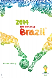
A reminder of how the men’s game is pictured:
Not only are players figured into the design above; they are figured into the design as in competition with each other. It would be interesting to see a similar gesture applied to representing the women’s game—but, from an advertising/marketing perspective, this is one of the “no-go” zones in the women’s game. Women competing directly against each other, physically challenging each other? Not as pretty as flowing hair, pretty eyes and high cheekbones.
That said, the 2015 Women’s World Cup has the best World Cup mascot ever. EVER. Someone please make me a lucha libre version of this:


Visually the poster is very appealing to me, but from a soccer perspective it’s a total fail. This poster is about CANADA and nothing about soccer. You should be able to look at it with no script and know what it’s about. All I get is that Canada is full of nature and one woman.
Yeah, I agree. I DO really like the poster, it is pretty! It’s dynamic even though SHE isn’t moving. But like Diane says, it’s all a bit one woman alone in the Canadian wilderness who’s never played football. Conversely, the Brazil poster, really mediocre design… but all about football. Which is better?? At the end of the day though, girls are going to want to put that Canada poster on their wall and that’s a win, surely?
I don’t know about girls putting posters of this on their walls. I mean, I would. But my niece, when she was a teen, had a poster of Steve Prefontaine on her wall—a picture of him running, in fact. Just eyeballing WC posters—they seem to either feature heroic figures in action; heroic figures with ball or trophy; or feature, simply, a graphic design that celebrates the host nation (USA ’74 posters, for example). They don’t feel quite so intensely gendered to me.